Module B

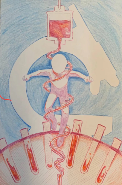
I don't know if it's that obvious, but our group put a lot of work into the concept of this piece. Since it's a poster, we wanted it to be easily understood what was in it. Thus, we opted for a more minimalist design than what you would normally find in poster projects (and it is easier on the team). The thought process behind this is that we wanted to present the blood and the RNA in an appealing way, so we merged them together. The person within the helix is signifying the support that Medical Technology provides. The silhouette of a microscope in the back is basically an easy way to communicate that the field deals with microorganisms and other small things that end up telling us about the big picture.
Unfortunately, I don't think the message was delivered very clearly. I myself am a staunch opposor of clutter and overdetailing, but perhaps the end result was too simple. To no fault of your own, I am honestly unhappy with this product. Not to mention the limitations of using colored pencils as opposed to pastels in such an iconographic composition (it doesn't exactly lend well to this).
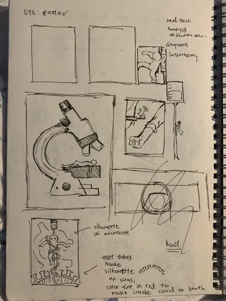
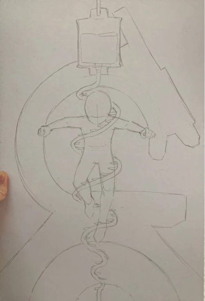
Below this are some concepts and process images of the poster.


